Apr 1, 2025
Death by UI: When Bad Visual Design Kills Good UX
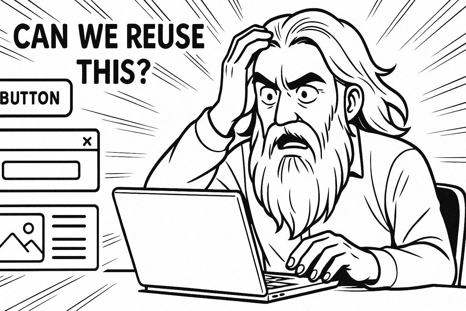
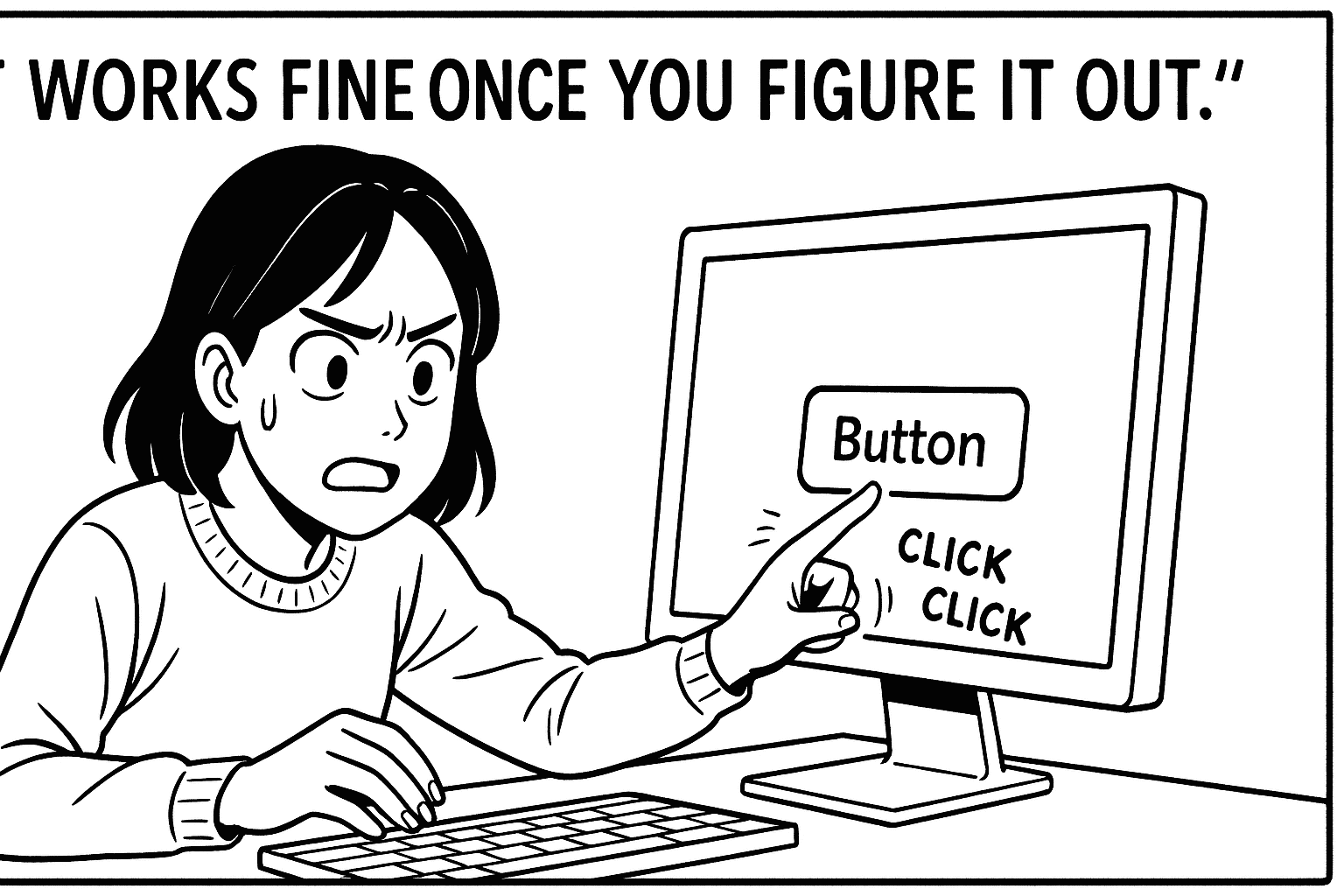
“It works fine once you figure it out.”
— The unofficial motto of bad visual design everywhere.
Here’s the thing: UX is not just about logic. It’s also about looks.
And no, I don’t mean “dribble shot” aesthetics or gradients that look like a unicorn exploded. I mean clarity. Visual hierarchy. Affordances that make sense. The stuff that makes people feel like your product has its act together.
I’ve worked on platforms where the information architecture was brilliant, the flows were smooth, and the user testing said, “Hey, this makes sense.”
And then we launched.
And nobody used it.
Why?
Because the UI looked broken. The typography whispered “prototype.” The buttons had commitment issues (is it a link? a tab? a ghost of a button past?). And the spacing felt like someone said, “Design it with your eyes closed.”
First impressions are brutal. Users don’t wait to dig deeper—they judge the experience by the surface. And poor visual design tells them:
“This wasn’t made for someone like you. Or maybe for anyone at all.”
Let me be blunt: Bad visual design can erode trust faster than a confusing onboarding flow.
But here’s where it gets fun: Visual design isn’t just “make it pretty.” It’s a functional language. You can direct attention, reduce cognitive load, and even increase task success rates just by making the right thing look like the right thing.
A few hard-won lessons from the trenches:
If everything is bold, nothing is bold.
Grey text on a grey background? Might as well be invisible ink.
Just because you know it’s a dropdown doesn’t mean the user does. Give it a freakin’ arrow.
And remember:
“Users don’t read manuals. They read screens.”
When your UI whispers clarity, your UX doesn’t have to shout.